Melbourne Housing Market Analysis: An Exploration using R and Power BI
0. Collecting and Importing the Data
The initial step in the analysis process involves gathering and importing the dataset. For this project, I utilised the Melbourne Housing Market dataset available on Kaggle (link). This dataset offers an extensive record of property sales in Melbourne, encapsulating crucial details such as the property type, location, size, sale price, and sale date. The data is in CSV format, making it easy to import into my R environment for further analysis.
1. Data Understanding and Exploration
The first analytical step after importing the data involves understanding and exploring the dataset. I aimed to familiarize ourselves with the data's structure, various attributes, and the preliminary statistical summary. I began by scrutinizing the initial few rows of the data using the head() function, which gives a snapshot of the dataset's structure and the information contained within each attribute.
Next, I obtained the dataset's dimensions with the dim() function, providing us with the number of rows (representing individual property sales records) and columns (representing different property attributes). For a more comprehensive statistical overview, I deployed the summary() function. This function produces a statistical summary for each attribute in the dataset, including the minimum, maximum, median, mean, and quartile values for numerical attributes, and count of unique categories for categorical attributes.
Here's the code snippet I used:
  # Load required libraries
  library(tidyverse)
  library(lubridate)

  # Load the data
  df <- read.csv('Melbourne_housing_FULL.csv')

  # Display the first few rows of the dataframe
  head(df)

  # Get the shape of the dataset
  dim(df)

  # Get the summary of the dataset
  summary(df)
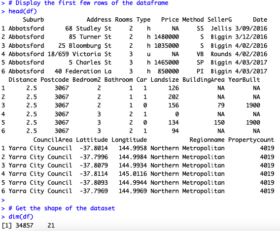
The data consists of 21 columns and 34857 rows:
The data types of the columns in the DataFrame are as follows:
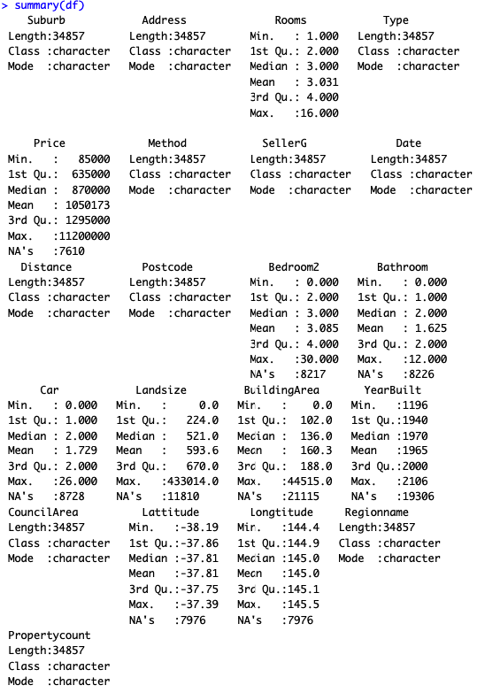
From the initial exploration, I can observe the following:
The exploration phase highlighted several areas for further investigation, such as missing values, potential outliers, and data type inconsistencies, which I address in the next step
2. Data Cleaning and Preprocessing
A crucial stage in any data analysis pipeline involves cleaning and preprocessing the data. This step ensures that the dataset is free of inconsistencies, errors, and missing values, thereby enabling more accurate analysis and reliable conclusions.
My initial exploration revealed several areas that required attention:
Here's how I tackled these issues:
- Missing Values: I took a strategic approach to handling missing values. For the 'Price' column, as it's crucial to my analysis, I decided to drop rows with missing values rather than filling them with averages or medians to avoid potential biases. For columns 'Distance', 'Postcode', 'CouncilArea', 'Regionname', and 'Propertycount', the missing values were relatively few compared to the dataset's size, so I dropped these rows. For the remaining columns with substantial missing values, I opted to keep these data points for this portfolio project.
- Data Types: I converted the 'Date' column to datetime format and split it into separate 'Year', 'Month', and 'Day' columns for more detailed time series analysis. The 'Distance' column was converted to a numerical type.
Here's the R code snippet showcasing my data cleaning and preprocessing steps:
  # Check for missing values
  colSums(is.na(df))

  # Drop the rows with missing values
  df_cleaned <- df %>% drop_na(Price, Distance, Postcode, CouncilArea, Regionname, Propertycount)

  # Check the count of missing values in each column again
  colSums(is.na(df_cleaned))

  # Convert 'Date' column to date type
  df_cleaned$Date <- dmy(df_cleaned$Date)

  # Split 'Date' into 'Year', 'Month', and 'Day' columns
  df_cleaned$Year <- year(df_cleaned$Date)
  df_cleaned$Month <- month(df_cleaned$Date)
  df_cleaned$Day <- day(df_cleaned$Date)

  # Drop the original 'Date' column
  df_cleaned <- df_cleaned %>% select(-Date)

  # Convert 'Distance' column to numerical type
  df_cleaned$Distance <- as.numeric(df_cleaned$Distance)
After these data cleaning and preprocessing steps, my dataset was ready for further analysis and visualisation. This meticulous process ensures the reliability and accuracy of my subsequent steps.
3. Data Visualisation
Visualisations provide a powerful tool for understanding data, revealing patterns, trends, and insights that may not be apparent from raw data. For this project, I turned to Power BI, a robust platform offering a suite of interactive visualisation capabilities.
The report leverages several visualisation types, each designed to illuminate different facets of the housing market data:
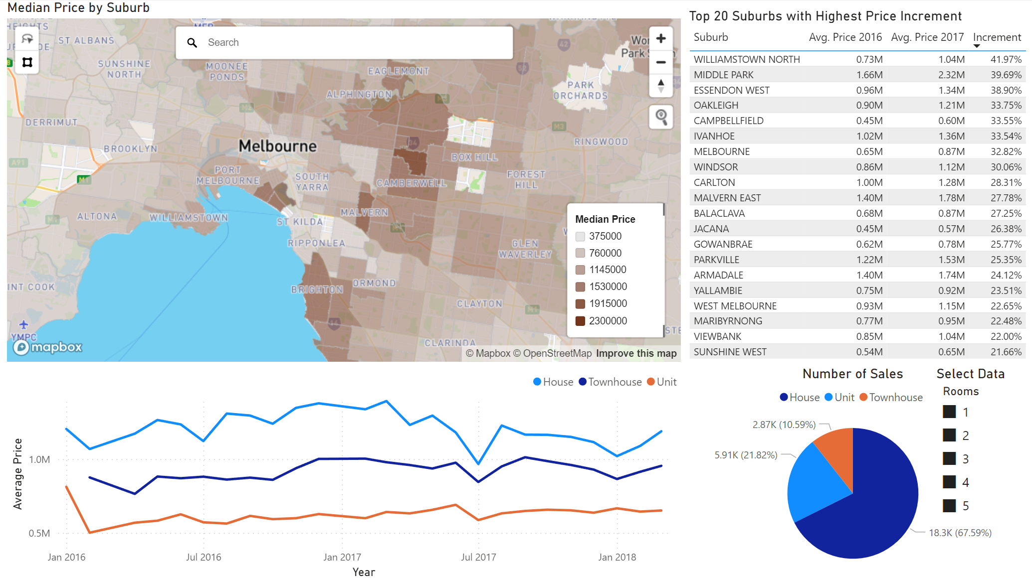
This is an interactive report that allows me to select and examine specific data. For instance, when I select the option for 3-bedroom properties, the dashboard narrows its focus, displaying data exclusively for these properties.
The dashboard review the following insights:
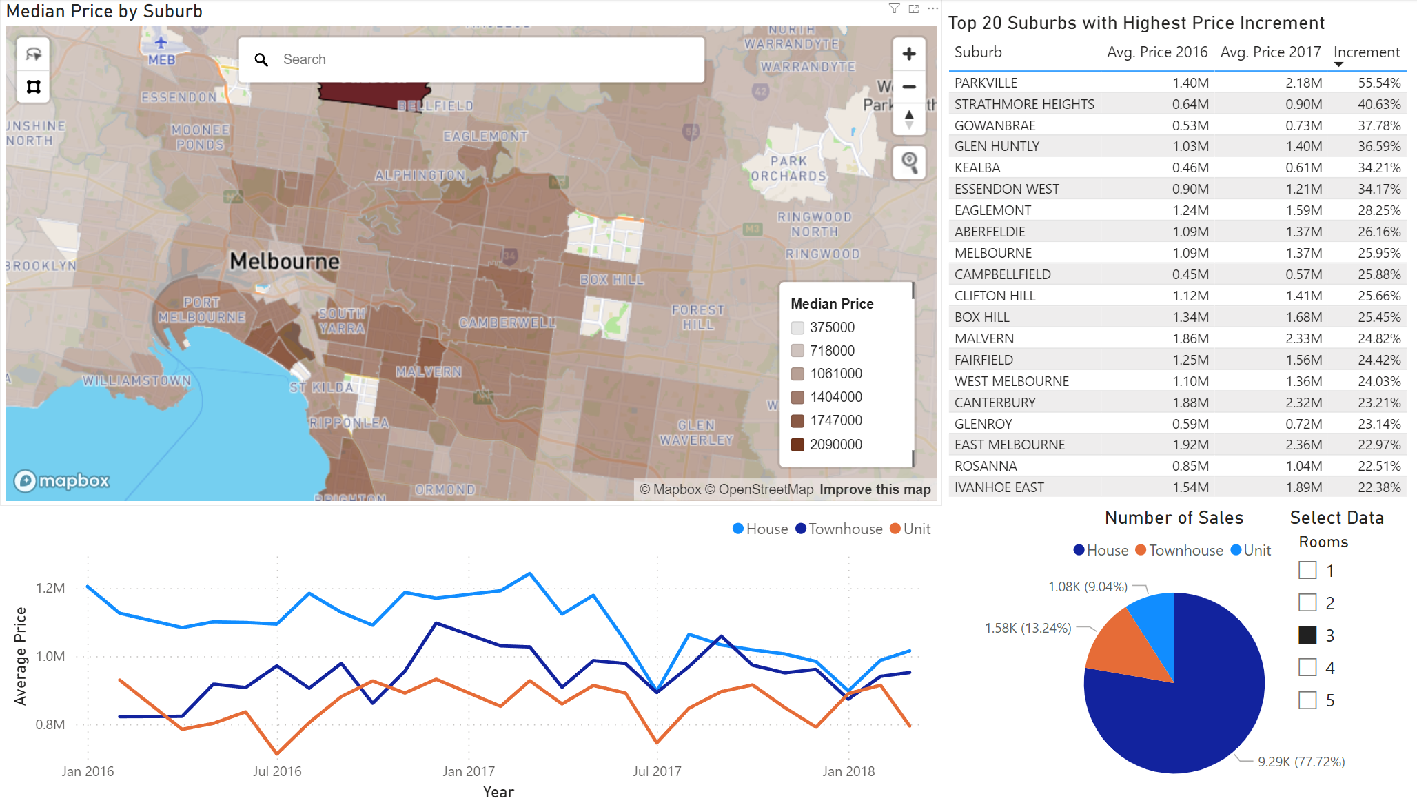
Here is the dashboard when switching to 2-bedroom properties:
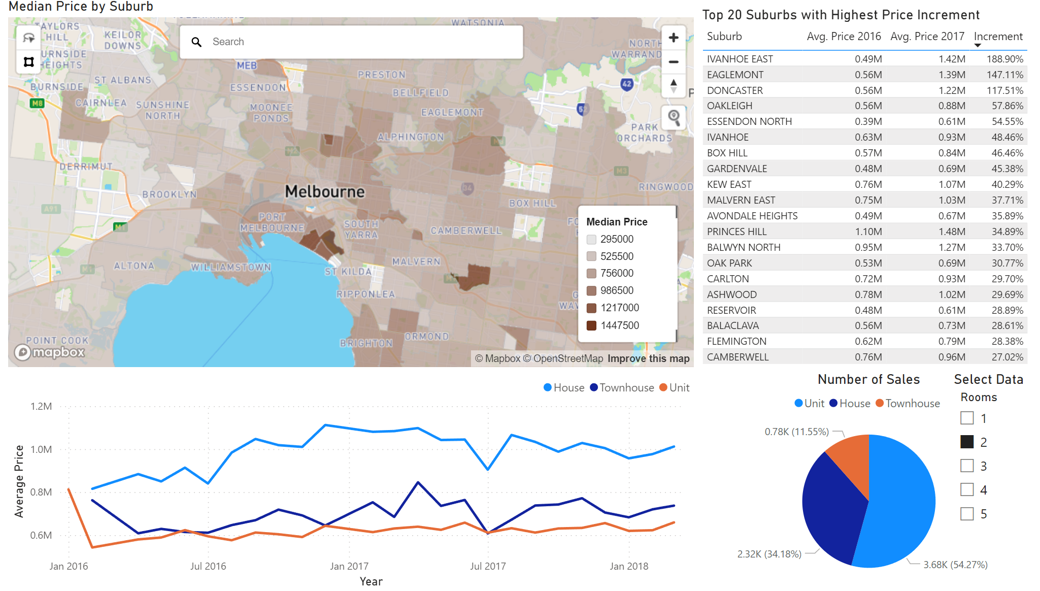
The dashboard uncovers different market dynamics:
The dashboard offers a comprehensive overview of Melbourne's real estate. I observed distinct trends and variations in the market, depending on property type and suburb location. For 3-bedroom properties, houses dominated the market, while for 2-bedroom properties, units were more popular. I also identified certain suburbs where prices grew substantially over a year, highlighting potential hotspots for investment. These insights can be invaluable for homebuyers, investors, and policy makers alike, helping them make informed decisions. However, real estate investment is multifaceted and it's crucial to consider other factors such as economic outlook, infrastructure development, population growth, and personal investment goals.
4. Conclusion
The data analysis and visualizations presented in this report provide in-depth insights into Melbourne's housing market dynamics, with specific focus on properties with 2 and 3 bedrooms. The dashboards designed using Power BI demonstrate the power of data visualization in understanding complex data and uncovering hidden trends and patterns.
The analysis reveals that property type and location significantly impact property prices. Suburbs like Albert Park, Middle Park, and Malvern command high prices for 3-bedroom properties, while for 2-bedroom properties, units are the most sold, particularly in suburbs like Ivanhoe East, Eaglemont, and Doncaster. The observed seasonality in prices suggests that timing plays an important role in property investment.
While this analysis provides valuable insights, it is important to note that property investment decisions should be based on a holistic analysis that takes into account a range of factors including individual investment goals, risk appetite, market conditions, and expert advice.
This portfolio project underscores my ability to handle complex datasets, clean and preprocess data, and use data visualization tools like Power BI to present data in an insightful and understandable manner. The project also showcases my ability to derive actionable insights from data that can guide decision-making in real-world scenarios such as property investment. With a strong foundation in R programming and data visualization, I am well-equipped to tackle complex data analysis tasks and provide meaningful insights.