Spatial Analysis of Bushfires in Australia
My objectives in this project are to explore the spatial distribution of the bushfires, identify any patterns or correlations in the data, and potentially predict future fire occurrences or characteristics. By understanding where and when bushfires are likely to occur, and what factors contribute to their occurrence, we can better manage and respond to these events, ultimately reducing their impact on the environment and communities.
0. Collecting and Importing the Data
To start, I downloaded the dataset in CSV format from this link. I then imported the CSV file into a Jupyter notebook and worked with Python language.
1. Data Understanding and Exploration
I started by loading the data into a pandas DataFrame and using methods like head(), info(), and describe() to understand the structure of the dataset. We'll also check the data types of each column using the following python codes:
  import pandas as pd
  # Load the data
  df = pd.read_csv('fire_archive_M6_96619.csv')

  # Display the first few rows of the DataFrame
  df.head()

  # Check the data types of each column
  df.info()
The data consists of 14 columns, each representing specific attributes of the properties:

The data types of the columns in the DataFrame are as follows:
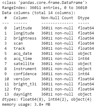
The object data type typically indicates a string or a mix of other data types. The acq_date and acq_time columns, for example, are not in date format. We might need to convert this to a datetime data type.
2. Data Cleaning and Preprocessing
In the following section, I will embark on the process of data preprocessing. This crucial step allows us to gain a deeper understanding of the variables within our dataset and to ensure the cleanliness and integrity of our data.
Upon initial inspection of the dataset, as illustrated in the table above, it is evident that there are no missing values. This is confirmed by the fact that the non-null counts for all columns align perfectly with the total number of data points.
Moving forward, it is essential to verify the uniqueness of our data by checking for any redundant or duplicate entries. This can be achieved by examining the dataset for any duplicate rows.
  # Check for duplicate rows
      df.duplicated().sum()
The output from this operation indicates that our dataset is free from duplicate rows, with a count of zero. This eliminates the need for any data removal in this instance.
Next, I will change the The acq_date and acq_time columns to datetime format:
The next step in our data preprocessing journey is to identify any potential outliers within our dataset. Outliers can often skew results and provide inaccurate representations of our data. To identify these, I will create boxplots for the numerical columns in the dataset.
  # Convert the 'acq_date' column to a datetime data type
  df['acq_date'] = pd.to_datetime(df['acq_date'])

  # Convert the 'acq_time' column to a time data
  df['acq_time'] = df['acq_time'].apply(lambda x: pd.to_datetime(str(x).zfill(4), format='%H%M').time())
  df.head()

The next step in our data preprocessing journey is to identify any potential outliers within our dataset. Outliers can often skew results and provide inaccurate representations of our data. To identify these, I will create boxplots for the numerical columns in the dataset.
  import matplotlib.pyplot as plt

  # List of numerical columns
  num_cols = ['latitude', 'longitude', 'brightness', 'scan', 'track', 'confidence','version','bright_t31','frp']

  # Create a boxplot for each numerical column
  for col in num_cols:
    plt.figure(figsize=(12, 0.5))
    plt.boxplot(df[col], vert=False)
    plt.title(col)
    plt.show()
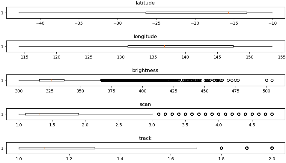
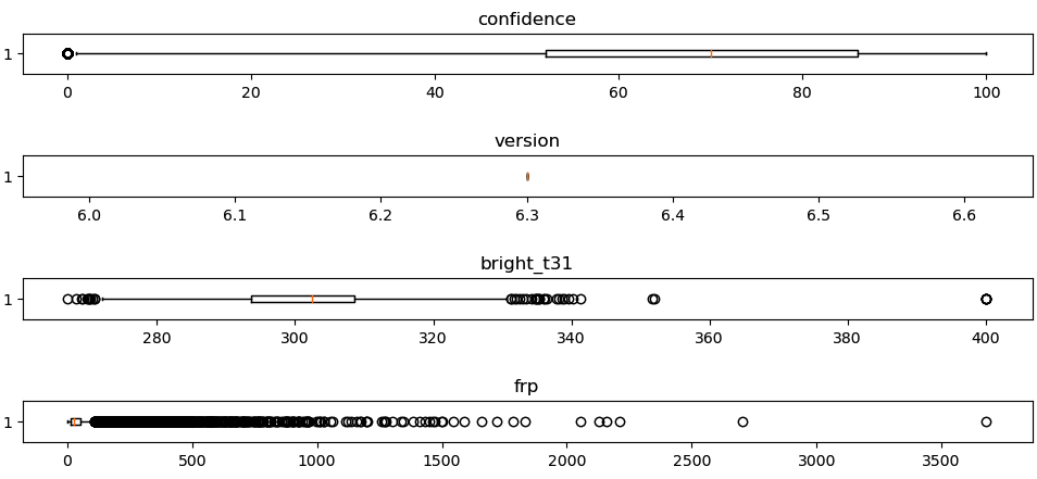
The boxplots provide a visual representation of the minimum, first quartile (25%), median (50%), third quartile (75%), and maximum values of each column. The dots represent potential outliers, which are values that are significantly higher or lower than the rest.
From the boxplots, it appears that the 'brightness’, ‘bright_t31’, and ‘frp’ column may have some outliers. These outliers should be handled based on the business context and the statistical distribution. I will visualise the data distribution of these columns to get more information.
  import seaborn as sns

  # List of numerical columns
  num_cols = ['brightness', 'bright_t31','frp']

  # Create a histogram for these columns
  for col in num_cols:
    plt.figure(figsize=(10, 6))
    sns.histplot(df[col], bins=30, kde=True)
    plt.title('Distribution of ' + col)
    plt.show()
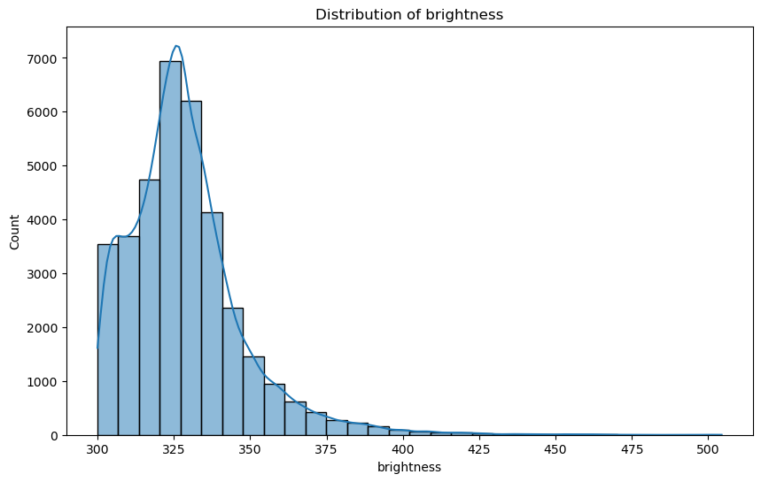
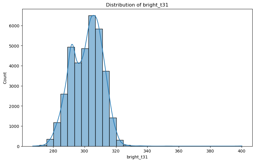
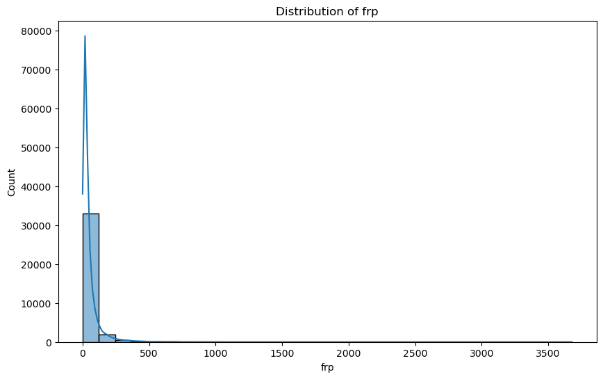
The visualisations indicate that outliers constitute a minor portion of the dataset. Given their limited presence, these outliers are unlikely to significantly impact the overall analysis. Consequently, I have decided to retain these data points for the subsequent stages of exploration.
3. Data Visualisation
To plot the bushfire locations on an Australian map, I need a shapefile or GeoJSON file that contains the geographical boundaries of Australia. This file will allow me to create a base map on which I can plot the bushfire locations.
I can find such files from various online sources, such as Natural Earth, GADM, or the Australian Bureau of Statistics. After download the GEoJSON file, I'll use geopandas to read this file and create the base map.
  import geopandas as gpd
  from shapely.geometry import Point

  # Create a 'geometry' column with Point objects
  geometry = [Point(xy) for xy in zip(df['longitude'], df['latitude'])]

  # Create a GeoDataFrame
  gdf = gpd.GeoDataFrame(df, geometry=geometry)

  # Load the Australia geographical boundaries data
  australia = gpd.read_file('georef-australia-state.geojson')

  # Create the base map
  base = australia.plot(color='white', edgecolor='black', figsize=(10, 6))

  # Plot the bushfire locations on the base map
  gdf.plot(ax=base, markersize=1, color='red', alpha=0.5)
  plt.title('Bushfire Locations on Australian Map')
  plt.show()
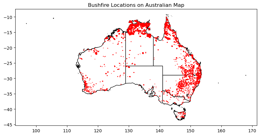 Based on the bushfire locations I have some observations as below:
Based on these observations, here are some recommendations:
In the forthcoming analysis, I will delve into the relationships between the measurement variables within the dataset, namely 'brightness', 'bright_t31', 'confidence', and 'frp'. To facilitate a clear understanding of these correlations, I will generate a heatmap that visually represents these interdependencies.
To add another layer of depth to our investigation, I will conduct separate correlation analyses for two distinct scenarios: 'day vs. night' and 'Terra vs. Aqua' satellite data. This approach will allow us to discern whether the time of day or the specific satellite used for data collection influences the measurement variables. By doing so, I can uncover nuanced insights that may otherwise remain hidden in a more generalized analysis.
  # List of numerical columns
  num_cols = ['brightness', 'bright_t31', 'confidence', 'frp']

  # Calculate the correlation matrix for the numerical columns
  correlation_day = df[df['daynight'] == 'D'][num_cols].corr()
  correlation_night = df[df['daynight'] == 'N'][num_cols].corr()

  # Create a heatmap for each correlation matrix
  plt.figure(figsize=(10, 8))
  sns.heatmap(correlation_day, annot=True, cmap='coolwarm', center=0)
  plt.title('Correlation Matrix (Day)')
  plt.show()

  plt.figure(figsize=(10, 8))
  sns.heatmap(correlation_night, annot=True, cmap='coolwarm', center=0)
  plt.title('Correlation Matrix (Night)')
  plt.show()

  # Calculate the correlation matrix for the numerical columns for each satellite
  correlation_terra = df[df['satellite'] == 'Terra'][num_cols].corr()
  correlation_aqua = df[df['satellite'] == 'Aqua'][num_cols].corr()

  # Create a heatmap for each correlation matrix
  plt.figure(figsize=(10, 8))
  sns.heatmap(correlation_terra, annot=True, cmap='coolwarm', center=0)
  plt.title('Correlation Matrix (Terra)')
  plt.show()

  plt.figure(figsize=(10, 8))
  sns.heatmap(correlation_aqua, annot=True, cmap='coolwarm', center=0)
  plt.title('Correlation Matrix (Aqua)')
  plt.show()

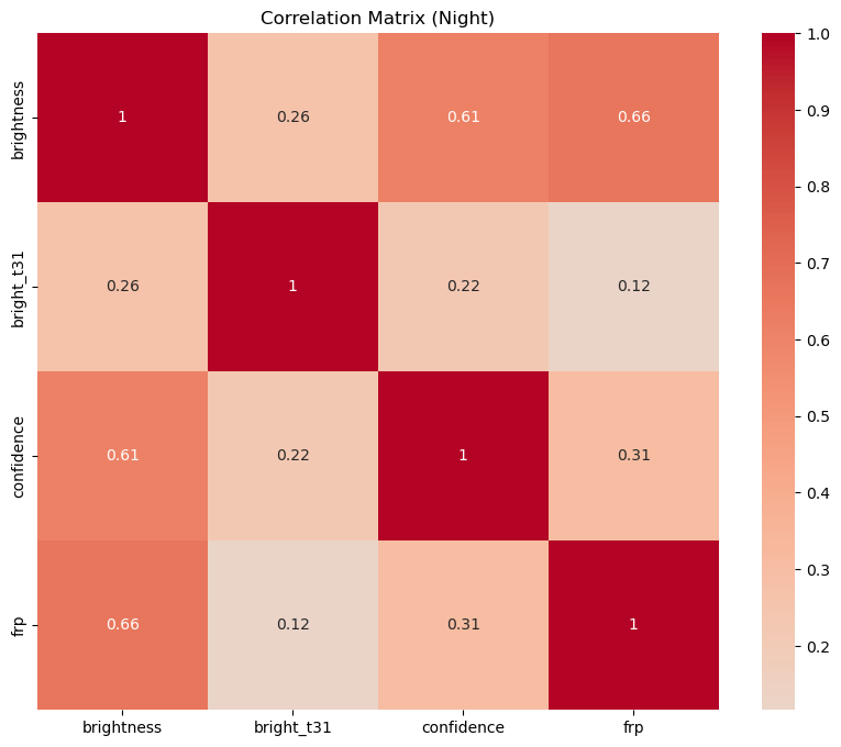

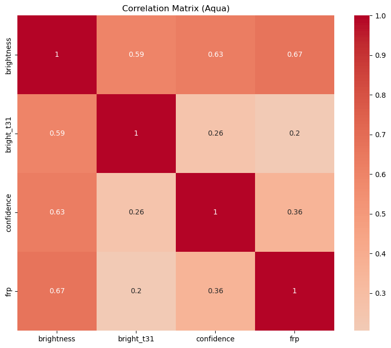 Each heatmap shows the correlation coefficients between the numerical variables. The correlation coefficient ranges from -1 to 1. If the value is close to 1, it means that there is a strong positive correlation between the two variables. When it is close to -1, the variables have a strong negative correlation. Let's discuss the results:
- Day vs Night: The correlation patterns between the variables are quite similar for day and night. However, the correlation between brightness and bright_t31 is slightly stronger during the day than at night. This could be due to the effect of sunlight on the brightness measurement.
- Terra vs Aqua: The correlation patterns are also similar for the Terra and Aqua satellites. However, the correlation between brightness and bright_t31 is slightly stronger for the Aqua satellite. This could be due to differences in the sensors or calibration of the two satellites.
Next, I will delve into the temporal distribution of bushfires throughout the day. This is achieved by executing the provided code, which counts the number of bushfires occurring at each hour of the day.
  # Extract hour from 'acq_time'
  df['hour'] = df['acq_time'].apply(lambda x: x.hour)

  # Count the number of bushfires in each hour
  hourly_counts = df['hour'].value_counts().sort_index()

  # Plot the number of bushfires in each hour
  plt.figure(figsize=(10, 6))
  sns.barplot(x=hourly_counts.index, y=hourly_counts.values, color='b')
  plt.title('Number of Bushfires in Each Hour')
  plt.xlabel('Hour of Day')
  plt.ylabel('Number of Bushfires')
  plt.xticks(rotation=45)
  plt.show()
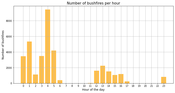 The resulting visualisation reveals a significant insight: the majority of bushfires are detected from midnight to 5 AM. This finding aligns with our understanding of human behavior and activity patterns. During these late-night to early-morning hours, most people are asleep, and consequently, any fires that ignite may go unnoticed for some time. This delay in detection could potentially allow the fires to grow in size and intensity, making them more challenging to control and extinguish.
Therefore, we should consider implementing more robust monitoring and early detection systems during these hours. Automated surveillance technologies, such as satellite imagery or ground-based sensors, could play a crucial role in this regard. By ensuring continuous and vigilant monitoring, we can improve our chances of detecting and responding to bushfires promptly, thereby mitigating their impact and safeguarding our communities.
4. Conclusion
Our analysis revealed concentrations of bushfires in certain regions, primarily in the northern and eastern parts of Australia. Sparse areas with fewer bushfires were also observed in central and western Australia. These findings highlight the need for targeted prevention and mitigation efforts, focusing resources on high-risk regions while further researching the factors contributing to bushfires.
Correlation analysis between measurement variables showed similar patterns for day and night observations, with slightly stronger correlations between brightness and bright_t31 during the day. Comparing the Terra and Aqua satellites, the correlations were also similar, with slightly stronger correlations observed for the Aqua satellite.
By utilising these insights, such as targeted prevention and monitoring, we can improve fire management strategies and enhance early detection systems. This knowledge has the potential to reduce the frequency and impact of bushfires, benefiting both the environment and affected communities.
In conclusion, this spatial analysis portfolio project showcased our skills in analysing the Australian Bushfire dataset. By understanding the spatial patterns, correlations, and potential for prediction, I aim to contribute to effective fire management, safeguarding the environment and communities from the devastating effects of bushfires.