Exploring Fitness Trends with Python: A Deep Dive into Fitbit Data
0. Collecting and Importing the Data
To start, I downloaded the dataset in CSV format from this link. I then imported the CSV file into a Jupyter notebook and worked with Python language.
1. Data Understanding and Exploration
To gain a deeper understanding of the dataset, I examined the structure and data types of the columns using the following python codes:
  import pandas as pd
  import matplotlib.pyplot as plt
  import seaborn as sns

  # Load the data
  data = pd.read_csv('dailyActivity_merged.csv')

  # Display the first few rows of the data
  data.head()
The data consists of 15 columns and 940 rows, each representing specific attributes of the properties:
2. Data Cleaning and Preprocessing
Next, let's perform some data cleaning and manipulation. We will check for missing values, convert the 'ActivityDate' column to a datetime format, and create new columns for the year, month, and day for easier analysis.
  # Check for missing values
    missing_values = data.isnull().sum()
    print('Missing values in each column:\n', missing_values)

    # Convert 'ActivityDate' to datetime format
    data['ActivityDate'] = pd.to_datetime(data['ActivityDate'])

    # Create new columns for year, month, and day
    data['Year'] = data['ActivityDate'].dt.year
    data['Month'] = data['ActivityDate'].dt.month
    data['Day'] = data['ActivityDate'].dt.day
    data.head()
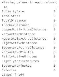
The data cleaning and manipulation has been successfully performed. Here's a summary:
3. Data Visualisation
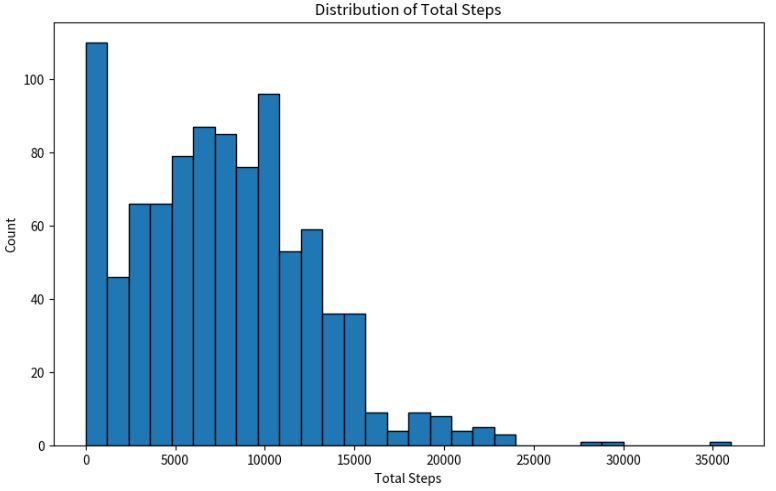
Next, let's analyse the FitBit Fitness Tracker Data to gain insights into how consumers use the FitBit app. We will start by exploring the distribution of total steps taken by users.
  import matplotlib.pyplot as plt

    # Plot the distribution of total steps taken by users
    plt.figure(figsize=(10, 6))
    plt.hist(data['TotalSteps'], bins=30, edgecolor='black')
    plt.title('Distribution of Total Steps')
    plt.xlabel('Total Steps')
    plt.ylabel('Count')
    plt.show()
Next, let's analyse the correlation between different variables in the dataset. This will help us understand the relationships between different activities logged by the Fitbit app.
  import seaborn as sns

    # Calculate the correlation matrix
    corr_matrix = data.corr()

    # Plot the heatmap of the correlation matrix
    plt.figure(figsize=(12, 8))
    sns.heatmap(corr_matrix, annot=True, cmap='coolwarm')
    plt.title('Correlation Matrix of FitBit Data')
    plt.show()
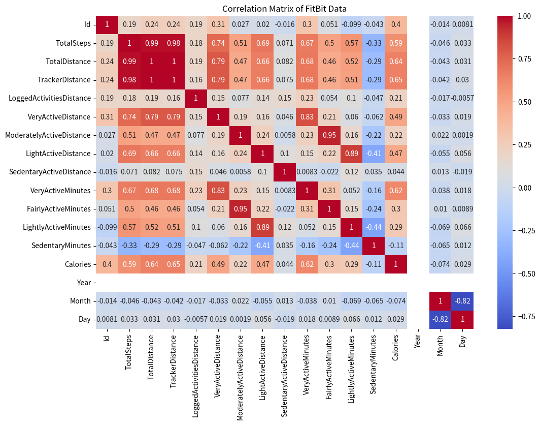
From the heatmap, we can observe that there are strong positive correlations between several variables. For example, 'TotalSteps' is highly correlated with 'TotalDistance', 'VeryActiveDistance', 'ModeratelyActiveDistance', 'LightActiveDistance', and 'Calories'. This suggests that the more steps a user takes, the more distance they cover and the more calories they burn, which is expected.
Next, let's analyze the average daily activities of the users. We will calculate the average values of 'TotalSteps', 'TotalDistance', 'VeryActiveMinutes', 'FairlyActiveMinutes', 'LightlyActiveMinutes', and 'SedentaryMinutes' for each day of the week. This will give us an idea of the users' activity levels on different days of the week.
  # Create a new column for the day of the week
  data['DayOfWeek'] = data['ActivityDate'].dt.dayofweek

  # Calculate the average daily activities for each day of the week
  average_daily_activities = data.groupby('DayOfWeek').mean()[['TotalSteps', 'TotalDistance', 'VeryActiveMinutes', 'FairlyActiveMinutes', 'LightlyActiveMinutes', 'SedentaryMinutes']]
  average_daily_activities
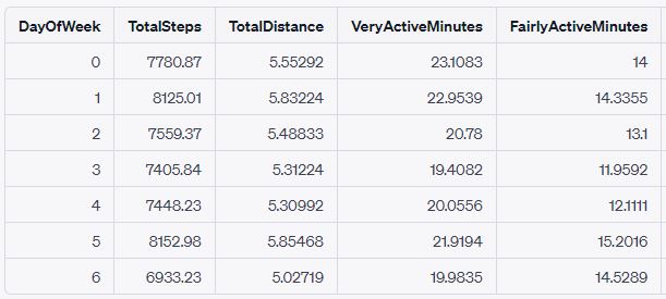
Note: The 'DayOfWeek' column uses the integer encoding, where Monday is 0 and Sunday is 6.
From the results, we can observe that users tend to be more active on Tuesdays (DayOfWeek 1) and Saturdays (DayOfWeek 5), as indicated by the higher average 'TotalSteps' and 'TotalDistance'. On the other hand, users tend to be less active on Sundays (DayOfWeek 6).
Next, let's analyse the trends in users' activity levels over time. We will plot the average 'TotalSteps' for each day of a week to see if there are any noticeable patterns or trends.
  # Calculate the average 'TotalSteps' for each day of the week
  average_daily_steps = data.groupby('DayOfWeek').mean()['TotalSteps']

  # Plot the average 'TotalSteps' for each day of the week
  plt.figure(figsize=(10, 6))
  average_daily_steps.plot(kind='line', marker='o')
  plt.title('Average Total Steps per Day of the Week')
  plt.xlabel('Day of the Week (0=Monday, 6=Sunday)')
  plt.ylabel('Average Total Steps')
  plt.grid(True)
  plt.show()
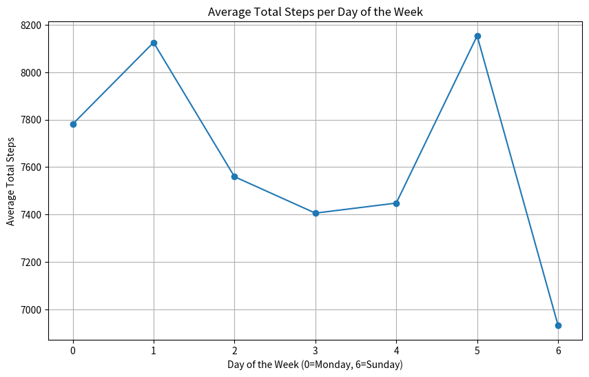
From the chart, we can observe that there's a significant increase in the average total steps from Monday (0) to Tuesday (1), followed by a gradual decrease throughout the rest of the week. This suggests that users tend to be more active at the beginning of the week, especially on Tuesdays.
These insights can be useful for Bellabeat's marketing strategy. For example, they can launch promotional campaigns or fitness challenges at the beginning of the week when users are more active. They can also target less active users towards the end of the week with specific programs or incentives to encourage them to be more active.
Next, let's analyze the users' active minutes in different activity levels ('VeryActiveMinutes', 'FairlyActiveMinutes', 'LightlyActiveMinutes', 'SedentaryMinutes'). We will calculate the average active minutes for each activity level and plot them in a bar chart for comparison.
  # Calculate the average active minutes for each activity level
  average_active_minutes = data[['VeryActiveMinutes', 'FairlyActiveMinutes', 'LightlyActiveMinutes', 'SedentaryMinutes']].mean()

  # Plot the average active minutes for each activity level
  plt.figure(figsize=(10, 6))
  average_active_minutes.plot(kind='bar', color=['#1f77b4', '#ff7f0e', '#2ca02c', '#d62728'])
  plt.title('Average Active Minutes in Different Activity Levels')
  plt.xlabel('Activity Level')
  plt.ylabel('Average Active Minutes')
  plt.xticks(rotation=0)
  plt.show()
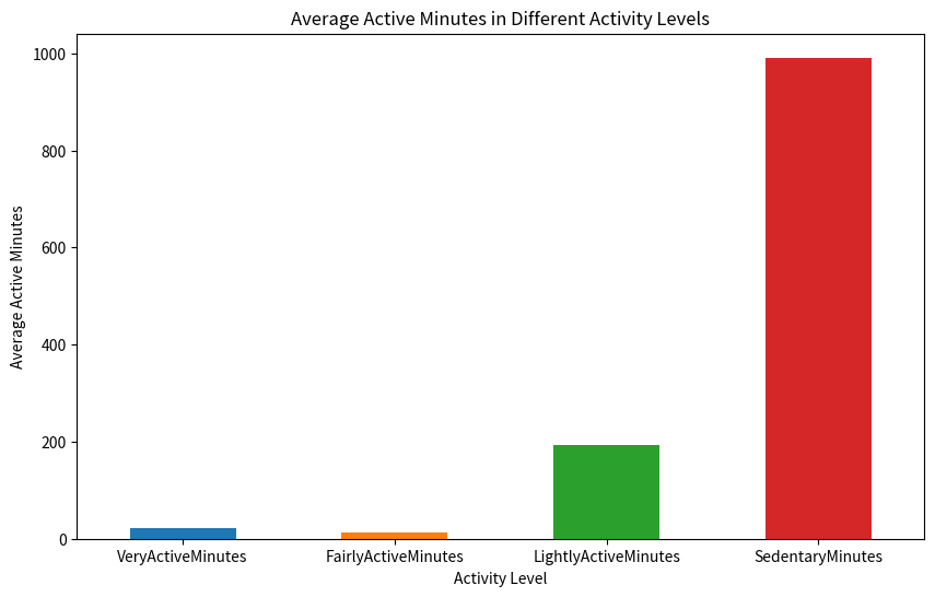
From the chart, we can observe that users spend the most time in 'SedentaryMinutes', followed by 'LightlyActiveMinutes'. They spend the least time in 'VeryActiveMinutes'. This suggests that most users are not very active and spend a lot of time in sedentary activities.
These insights can also be useful for Bellabeat's marketing strategy. For example, they can develop programs or features that encourage users to reduce their sedentary time and increase their active time. They can also provide personalized recommendations based on users' activity levels to help them achieve a more balanced lifestyle.
4. Conclusion
In this data analysis project, we analyzed FitBit Fitness Tracker Data to gain insights into how consumers use the FitBit app and to discover trends that could inform Bellabeat's marketing strategy. Our analysis revealed several key findings:
- Activity Date: Users tend to be more active on Tuesdays and Saturdays, as indicated by the higher average 'TotalSteps' and 'TotalDistance'. On the other hand, users tend to be less active on Sundays.
- Correlations: There are strong positive correlations between several variables. For example, 'TotalSteps' is highly correlated with 'TotalDistance', 'VeryActiveDistance', 'ModeratelyActiveDistance', 'LightActiveDistance', and 'Calories'. This suggests that the more steps a user takes, the more distance they cover and the more calories they burn.
- Trends Over Time: There's a significant increase in the average total steps from Monday to Tuesday, followed by a gradual decrease throughout the rest of the week. This suggests that users tend to be more active at the beginning of the week, especially on Tuesdays.
- Activity Level: Most users are not very active and spend a lot of time in sedentary activities. They spend the most time in 'SedentaryMinutes', followed by 'LightlyActiveMinutes'. They spend the least time in 'VeryActiveMinutes'.
These insights can be highly valuable for Bellabeat's marketing strategy. For example, they can:
Overall, this analysis provides a deeper understanding of users' fitness behaviours and patterns, which can help Bellabeat to better tailor their products and marketing efforts to meet the needs and preferences of their users.