COVID-19 Data Analysis and Visualisation Using SSMS and Tableau
0. Collecting and Importing the Data
This portfolio project involved analyzing the COVID-19 dataset. Instead of using Excel, I opted to leverage the power of SQL Server Management Studio (SSMS) for data analysis. Here are the reasons behind this decision:
The data is downloaded from: https://ourworldindata.org/covid-deaths
To import the data, I transformed the provided CSV file into a suitable format (e.g., Excel) and imported it into SSMS for further analysis.
1. Data Understanding and Exploration
To gain a deeper understanding of the dataset, I first examined the structure and data types of the columns in the CovidData table using the following SQL query in SSMS:
Furthermore, I checked the percentage of null values in important columns, such as the new_deaths column, to assess the data quality and completeness:
2. Data Cleaning and Preprocessing
As part of the data cleaning process, I replaced null values in the new_deaths column with 0 using the following SQL update statement:
3. Extracting Tables for Data Visualisation
To extract meaningful insights from the dataset, I constructed SQL queries to obtain specific information for visualisation purposes. Here are a few examples:
4. Data Visualisation
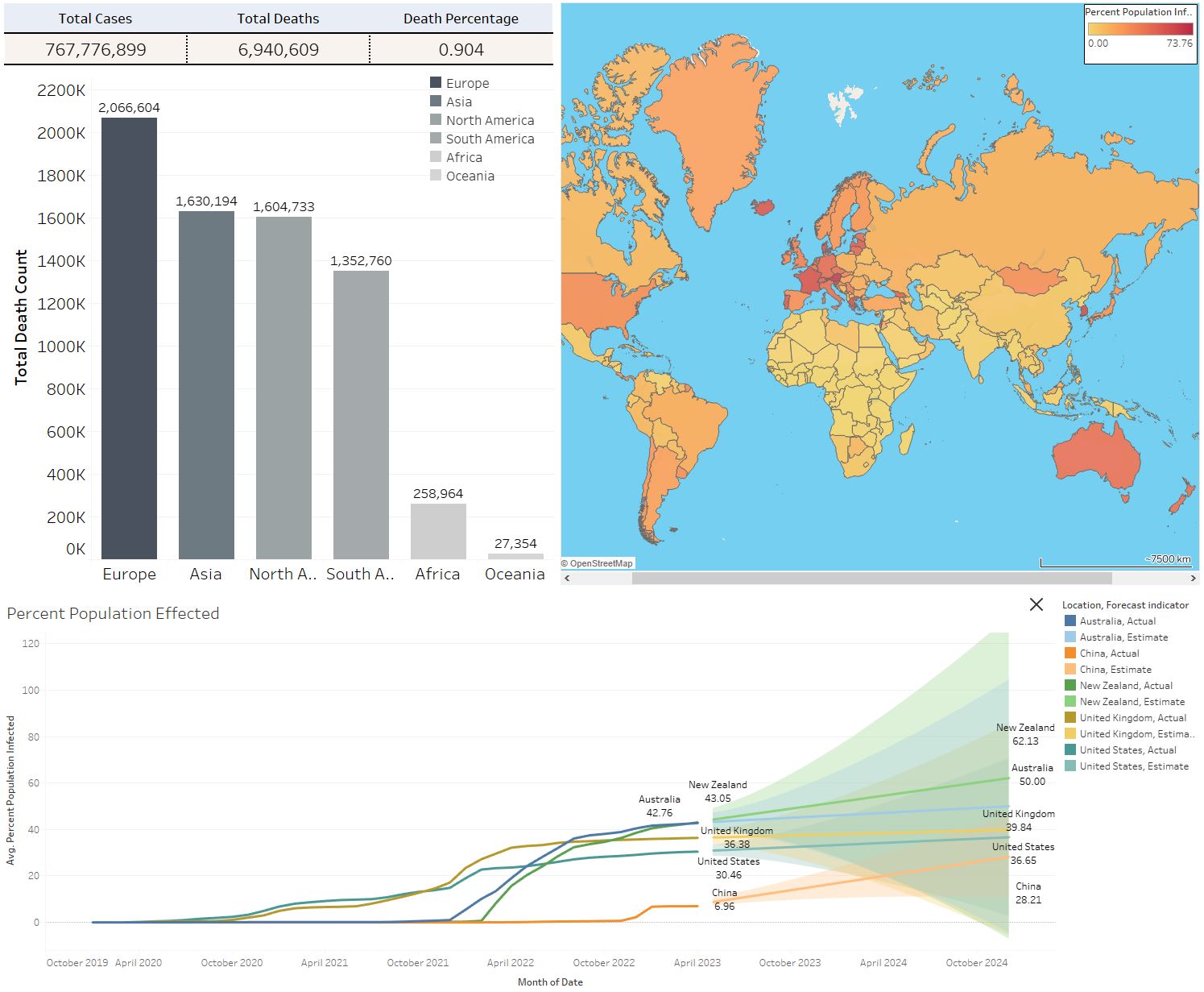
To create impactful visualisations and better communicate the insights, I loaded the processed data into Tableau. Using Tableau's rich visualisation capabilities, I created various charts, graphs, and interactive dashboards. These visualisations allowed me to effectively present trends, patterns, and comparisons in the COVID-19 data.

By combining data analysis with powerful visualisation tools like Tableau, I was able to derive meaningful insights from the COVID-19 dataset and effectively communicate them to a broader audience. The dashboard can be accessed on my Tableau Public Profile via this link.
5. Conclusion
This portfolio project showcased my skills in data analysis, data cleaning, preprocessing, and data visualisation. By utilizing SQL Server Management Studio for data processing and Tableau for visualisation, I was able to gain insights into the COVID-19 dataset and present them in an engaging and informative manner. Through this project, I demonstrated my ability to extract actionable insights from complex datasets and effectively communicate them using data visualisation techniques.